


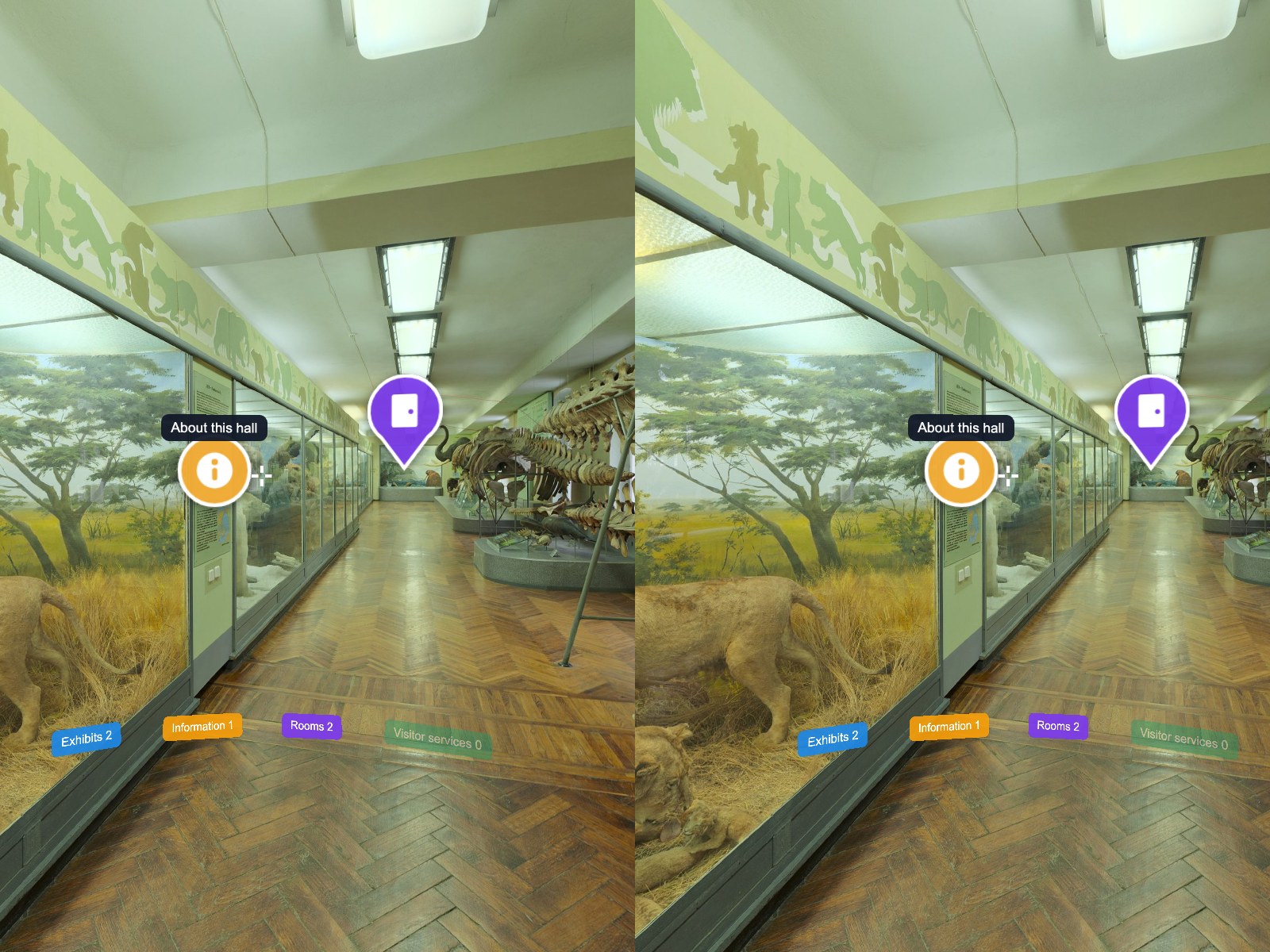
One look for the whole tour
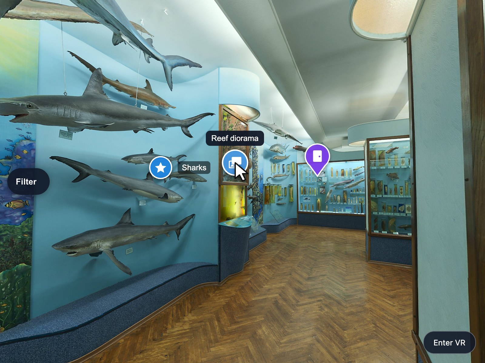
Six themes, five shapes, 69 own icons and free colours give every hotspot of every scene the same branded marker.
krpano Plugins
 krpano v1.0.0 New
One look, one order and one visitor filter for every hotspot of your krpano tour — in 2D and in VR.
Verified for krpano 1.23.2–1.24
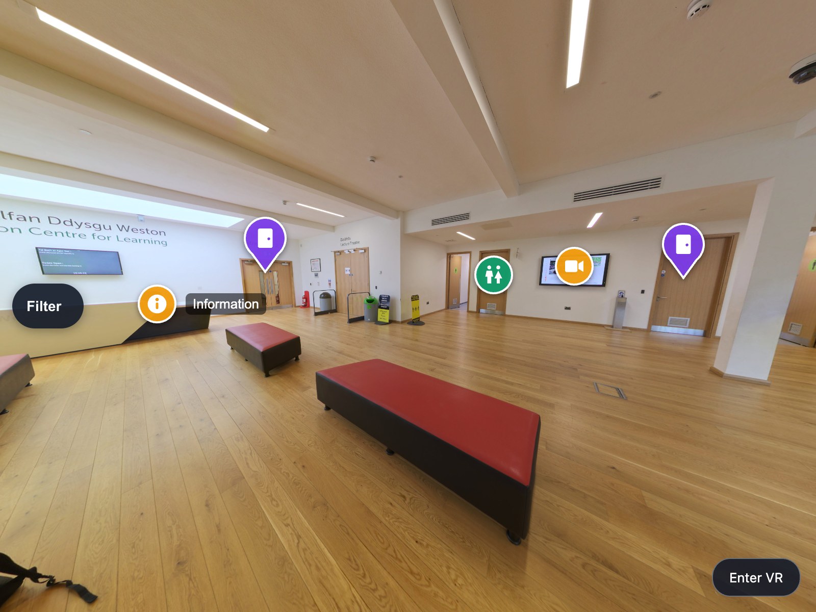
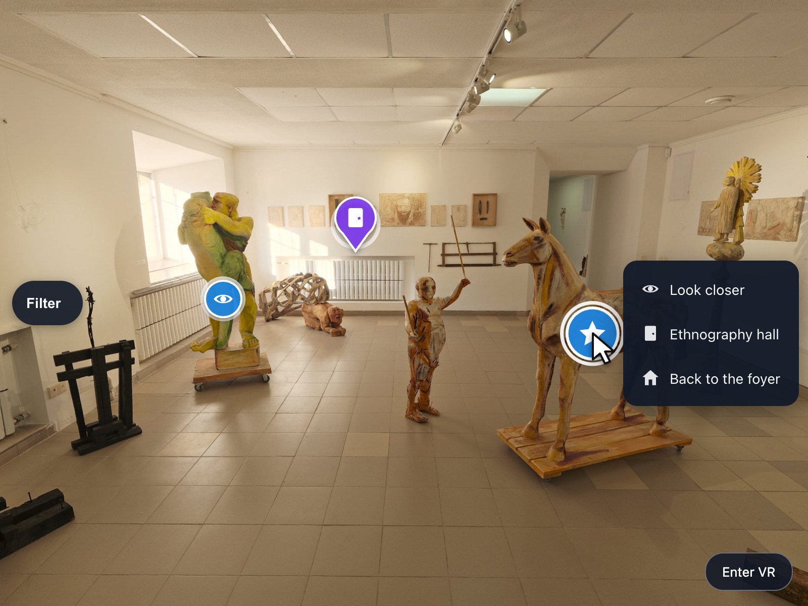
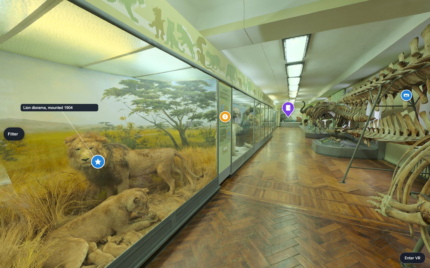
A tour with dozens of hotspots has no shared look and no order: every scene is styled by hand, and a crowded panorama gives the visitor no way to see only what interests them. Hotspot Kit gives every hotspot the same branded marker — icon, colour, shape, states, tooltip and callout — puts them into categories the visitor can switch on and off, and puts up to six actions behind one marker. The markers are drawn the way krpano draws its panorama, so the same styled hotspot is there when the visitor puts on a headset.
Put the encrypted plugin folder into your tour and add one plugin element to your tour XML.
Declare the categories of your tour once, with their colour, icon and shape, and give each hotspot the one it belongs to.
A theme, a style or a category changes every marker in every scene at once — no scene is edited by hand.
Six themes, five shapes, 69 own icons and free colours give every hotspot of every scene the same branded marker.
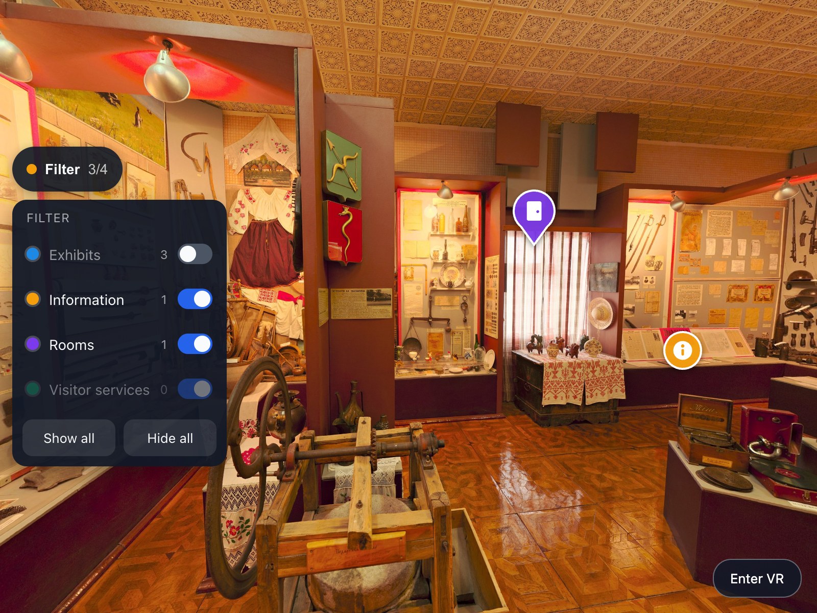
Categories with a filter panel let a visitor hide what does not interest them, with counts per scene and the choice kept for the visit.
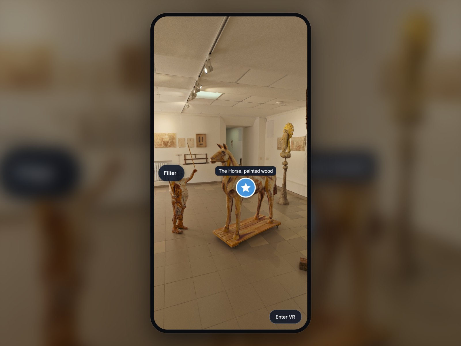
The marker, its label and its filter are drawn into the panorama, so they are still there in a headset — where HTML and CSS never arrive.
One rule restyles a tour that already exists; the kit adds its events beside yours, and switching it off puts every value back.
Set as attributes in your tour XML.
| Setting | Type | Default | Description |
|---|---|---|---|
active | Yes / No | true | Switches the whole kit on or off at runtime; false gives every hotspot its original look and events back (default true). |
theme | List | solid | The widest level of the look: the six themes are sets of defaults for every style key (default solid). |
default_style | Text | — | Name of a <z360_hotspot_kit_style> element used by every marker that has no style of its own (default: none). |
adopt | List | marked | marked takes only hotspots that carry a z360_hotspot_kit_* attribute; rules also takes what a <z360_hotspot_kit_rule> matches (default marked). |
debug | Yes / No | false | Prints how many hotspots were taken over and restored to the browser console (default false). |
animation_max | Number | 20 | How many markers may run their idle animation at the same time, the ones nearest the middle of the view first (0–200, default 20). |
visited_memory | List | session | session remembers the visited markers for the browser session, none forgets them at once (default session). Nothing is stored beyond the session. |
reduced_motion | List | auto | auto follows the visitor’s "reduce motion" system setting, on always switches the motion off, off always animates (default auto). |
keyboard | List | auto | auto gives keyboard-focusable markers to devices with a mouse and WebGL markers to touch devices; true forces keyboard markers everywhere, false forces WebGL markers everywhere (default auto). |
panel | Yes / No | true | Shows the visitor’s filter panel; false keeps the categories but gives the visitor no panel (default true). |
panel_slot | List | middle-left | Where the filter panel sits on the screen; the shared core keeps our plugins from overlapping there (default middle-left). |
panel_offset | Text | 12|0 | Distance of the filter panel from the edge of its slot, as x|y in stage pixels (default 12|0). |
panel_start | List | collapsed | Whether the filter panel starts as a small button or already open (default collapsed). |
panel_counts | List | scene | scene shows how many markers of a category are in the current scene, none shows no counts; it decides only whether the number is drawn, never what panel_empty knows (default scene). |
panel_empty | List | disable | What happens to a category with no marker in this scene: hide it, show it greyed out, or show it normally — the compact VR chip row follows the same rule (default disable). |
panel_show_all | Yes / No | true | Shows the "Show all" and "Hide all" buttons at the bottom of the filter panel (default true). |
panel_max_height | Number | 60 | Largest height of the open filter panel as a percentage of the screen; a longer list scrolls inside itself (20–100, default 60). |
text_panel_title | Text | Filter | The title of the filter panel and the text on its collapsed button; with lang_keys it is a key, and an unanswered key falls back to "Filter" (default "Filter"). |
text_show_all | Text | Show all | The text of the "show every category" button; with lang_keys it is a key, and an unanswered key falls back to "Show all" (default "Show all"). |
text_hide_all | Text | Hide all | The text of the "hide every category" button; with lang_keys it is a key, and an unanswered key falls back to "Hide all" (default "Hide all"). |
remember | List | session | session keeps the visitor’s filter for the visit and reads it from a link, url only reads it from the link, none remembers nothing (default session). The kit never writes the page address. |
tooltip | List | hover | hover shows a marker’s text while it is pointed at, always shows the texts of the markers in view, zoomed only below labels_fov_below, none never (default hover). |
tooltip_touch | List | first-tap | On a touch screen: first-tap shows the text and the second tap runs the action, long-press shows it after half a second, direct runs the action at once (default first-tap). |
tooltip_delay | Number | 0.15 | Seconds between pointing at a marker and the tooltip appearing (0–2, default 0.15). |
tooltip_max_width | Number | 260 | Largest width of a tooltip in stage pixels; longer text wraps (80–600, default 260). |
tooltip_position | List | auto | auto picks the side that fits and keeps the tooltip on the screen; a named side is kept and only shifted (default auto). |
callout_line | Text | 1|#FFFFFFCC | The leader line of a callout as width|colour, or none for no line (default 1|#FFFFFFCC). |
labels_fov_below | Number | 0 | Field of view in degrees below which permanent labels and zoomed tooltips appear; 0 means no threshold (0–179, default 0). |
navigate_mode | List | event | event leaves the scene transition to the tour and to our other plugins, native lets the kit choose the blend in navigate_blend (default event). |
navigate_blend | Text | BLEND(0.6) | The krpano blend expression used when navigate_mode is native (default BLEND(0.6)). |
send_track | Yes / No | true | Sends a z360_track event on a marker click, a menu action and a filter change, for the tour’s own statistics (default true). |
pause_on_media | Yes / No | true | Stops the idle animations while a video or sound of another z360 plugin plays, and starts again only what it stopped (default true). |
scale_mode | List | fixed | fixed keeps every marker the same size at every zoom, zoom lets it grow and shrink with the zoom inside size_limits (default fixed). |
size_limits | Text | 16|72 | Smallest|largest marker size in screen pixels for scale_mode="zoom" (default 16|72). |
hide_fov_above | Number | 0 | Above this field of view in degrees the markers of priority="low" are hidden and switched off; 0 switches the rule off (0–179, default 0). |
declutter | Number | 0 | Largest number of permanent labels on the screen at once, the ones nearest the middle of the view first; 0 shows all of them (0–50, default 0). |
distance_fade | Text | 0|0 | Fades markers by their distance from the camera, as start|end in krpano units — not centimetres; 0|0 is off. Needs a depthmap or 3D scene, or a depth of its own on each hotspot (default 0|0). |
vr_scale | Number | 1.6 | How much the markers grow when the visitor puts on a headset (1–4, default 1.6). |
vr_hit_padding | Number | 0.5 | Invisible extra target around every marker in VR, as a multiple of its size; 0 switches it off (0–2, default 0.5). |
vr_dwell | List | auto | auto adds a gaze selection only when the tour’s own VR configuration has none, on always adds it, off never (default auto). |
vr_dwell_time | Number | 1.5 | Seconds a gaze has to rest on a marker before it is selected (0.5–5, default 1.5). |
vr_labels | List | gaze | In VR: gaze shows a marker’s tooltip while it is looked at, always shows the tooltips of the markers in view, none shows no labels (default gaze). |
vr_panel | List | hide | hide leaves the filter out of VR, compact draws a row of category chips below the horizon that the visitor looks down at, each with the same label and count as its row on the flat screen (default hide). |
lang_keys | Yes / No | false | Reads every text of the kit as a key of the tour’s own <languages> tables, so the markers change language with the tour; the three texts the kit owns — the panel title and its two buttons — fall back to readable English when the tables do not answer their key, while your own texts (category labels, tooltips, callouts, action labels) are drawn exactly as you wrote them, so a key your tables do not answer is shown to the visitor as that key (default false). |
hide_on_compare | Yes / No | true | Hides and switches off the markers while our Compare Views plugin shows a comparison, and brings them back afterwards (default true). |
search_reveal | Yes / No | true | Shows a category again when the visitor finds one of its markers with the search of our Tour Navigator, so no search hit is dead (default true). |
icon | Text | dot | Which of the 69 icons a marker shows, for example info, star, door, wc or plane (default dot). |
shape | List | circle | The shape of the badge behind the icon; a pin stands with its tip on the hotspot’s position, every other shape is centred on it (default circle). |
size | Number | 36 | Size of the marker in screen pixels (16–128, default 36; the theme minimal uses 28). |
color | Color | #FFFFFF | Colour of the icon inside the badge (default #FFFFFF, from the theme). |
bg_color | Color | #1E88E5E6 | Colour of the badge, with optional transparency as #RRGGBBAA (default #1E88E5E6, from the theme). |
border | Text | 2|#FFFFFF | The ring around the badge as width|colour, or none (default 2|#FFFFFF, from the theme). |
shadow | Yes / No | true | Draws a soft drop shadow under the marker so it stays readable on a light panorama (default true, from the theme). |
label | List | none | Where a marker’s permanent label stands, or none for no permanent label (default none). On one hotspot the position is z360_hotspot_kit_label_pos. |
text_css | Text | — | Extra CSS for the label, the tooltip and the callout, for example a font family or a bigger size (default: none). |
animation | List | ring | The idle animation that makes a marker noticeable: a pulse, an expanding ring, a small bounce, a breathing fade or a soft glow (default ring). |
animation_interval | Number | 4 | Seconds of rest between two runs of the idle animation; 0 never rests (0–60, default 4). |
hover_scale | Number | 1.15 | How much a marker grows while it is pointed at or has the keyboard focus (1–2, default 1.15). |
hover_bg_color | Color | — | Badge colour while the marker is pointed at; empty mixes its own colour 18 % towards white (default: empty). |
active_mode | List | ring | How a marker shows that the window it opened is open: a ring around it, a filled badge, or nothing (default ring). |
visited_mode | List | dim | How a marker the visitor has already opened looks: dimmed, with a small check mark, or unchanged (default dim). |
<!-- hotspotkit.xml, included once by your tour.xml -->
<plugin name="z360_hotspot_kit"
        url="plugins/z360_hotspot_kit/z360_hotspot_kit.js"
        keep="true"
        theme="solid"
        declutter="4"
        vr_panel="compact" />

<z360_hotspot_kit_category name="exhibits" label="Exhibits" order="1" icon="star" bg_color="#1E88E5E6" />
<z360_hotspot_kit_category name="rooms"    label="Rooms"    order="2" icon="door" bg_color="#7C3AEDE6" shape="pin" />

<z360_hotspot_kit_action name="go_hall" type="navigate" label="Mammal hall" icon="door" scene="scene_hall_of_mammals" />

<!-- in your scene: an ordinary krpano hotspot, with no image of its own -->
<hotspot name="poi_lion" ath="-30" atv="12.7"
         z360_hotspot_kit_category="exhibits"
         z360_hotspot_kit_tooltip="Lion diorama, mounted 1904"
         z360_hotspot_kit_callout="-7|-15" />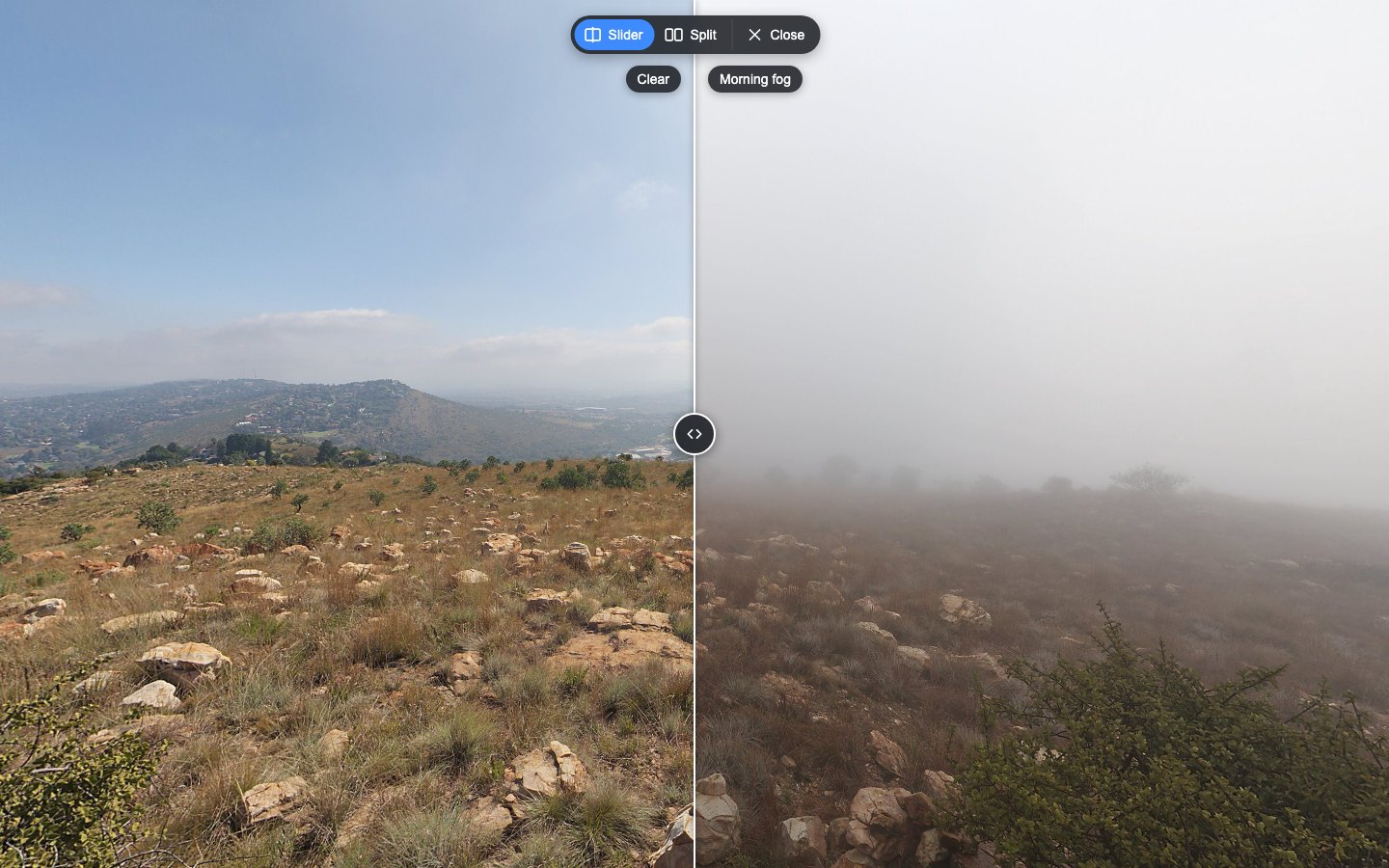
Compare two captures of the same place in your krpano tour: drag a divider or show them side by side, always in exactly the same view.
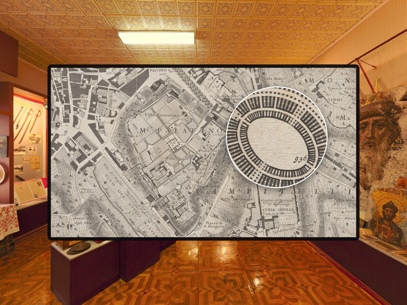
A magnifier lens for photos in krpano tours – with mouse, pen and touch.
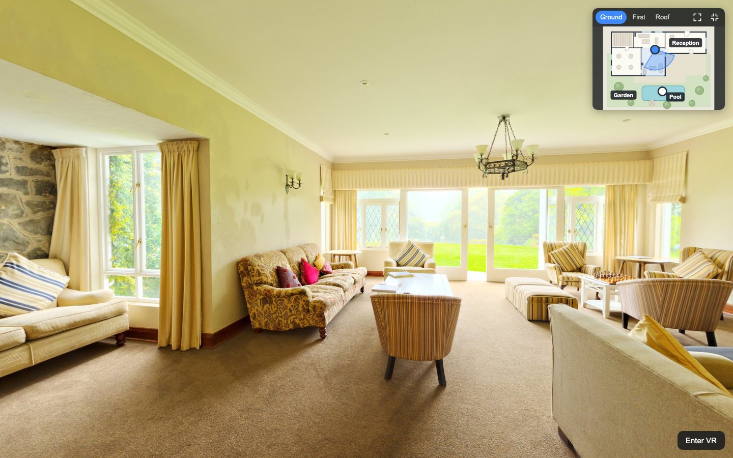
An interactive floor plan for your krpano tour: a radar shows where visitors stand and where they look, on every floor.